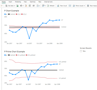
Laney P Prime SPC chart in Power BI
Projects | Links:
A flexible p prime / p chart with Laney correction Includes switch to turn screening of average moving range on or off.
Regular P chart on top does not deal with large denominators.
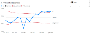
The P Prime chart below does.
There is some debate about whether the average moving range should be screened for values above a given constant, before calculating the control limits.
The user can choose to screen the results or not, via the slicer.