
Expanding my horizons
How discovering horizon plots helped solve a data visualisation problem so executives could see years of patient safety performance at a glance.
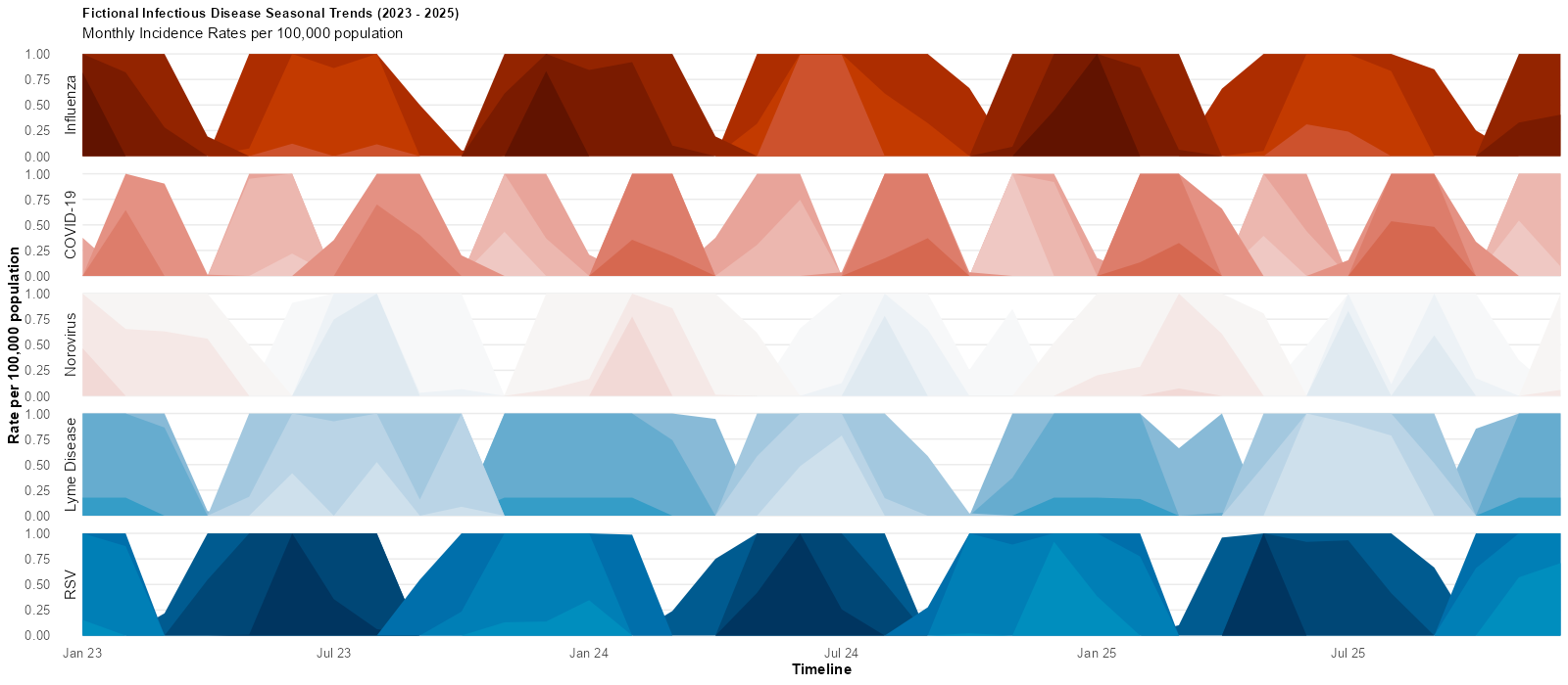
We reported the progress of our quality improvement programme using run charts. Unfortunately the volume of ward areas, and the disparate improvement benchmarks made it very difficult to produce concise reporting. SSRS report matrixes helped, but it was still hard to spot issues at a glance.
However, I realised we could switch from examining performance relative to each individual ward area benchmark, and compare to our target overall benchmark. This was where we needed to be by the end of the programme.
Around the same time, I discovered horizon plots, for displaying large amounts of time series performance data relative to target, in a small space. Introducing the concept was potentially difficult, as everyone was comfortable with run charts. However, everyone quickly understood that any blue on the plot was great, as it meant we were in our desired performance area, and that the varying shades of red meant that we were further away.
We could see problem areas at a glance. Reports quickly progressed from a large double sided A3 that displayed the entire programme, to being ported to R and also to SSRS. I linked several reports so we had an organisational overview, which linked to hospital and then ward level reports.